CSS Gradient Generator – Create Linear, Radial & Conic Gradients
About the CSS Gradient Generator
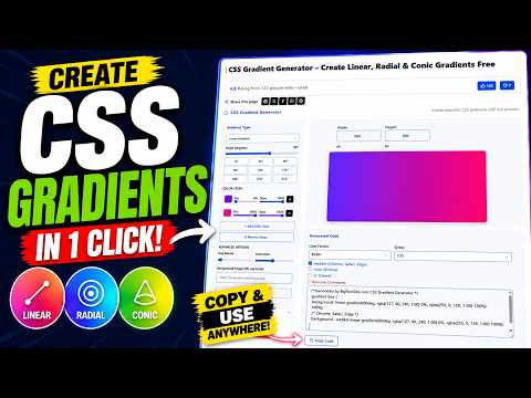
The CSS Gradient Generator builds linear, radial, and conic gradients visually and writes the CSS as you work. Add as many color stops as you need, set each one’s position and opacity, adjust the angle or shape, and copy production-ready code in whichever color format and syntax your project uses.
Gradients are one of the few visual effects browsers render natively, which makes them cheap. A background that would otherwise be a 200KB image becomes a single line of CSS that scales to any viewport, costs no HTTP request, and stays sharp on any display density. That is why gradients have stayed in the toolkit through every design trend since they landed in CSS3.
The three types solve different problems. Linear transitions along a straight axis and covers most real use: hero backgrounds, buttons, overlays on photographs. Radial radiates from a point and works for spotlights, vignettes, and soft focal glows. Conic sweeps around a center point, which makes it the only one that can draw a pie chart segment or a color wheel in pure CSS.
Worth knowing about angles, because they trip people up: in CSS gradient syntax 0deg points to the top and angles increase clockwise, so 90deg runs left to right and 180deg runs top to bottom. That is the opposite convention to the one most graphics software uses, which is why a gradient sometimes appears upside down compared to a mockup.
The other common frustration is a gradient that turns muddy or grey in the middle. This happens because browsers interpolate between stops in sRGB, and blending two saturated colors from opposite sides of the color wheel drags the midpoint toward grey. The fix is to add one or two intermediate stops in a color you actually want to see, rather than letting the browser pick the path between your endpoints.
The designers and developers who build BigToolSite’s CSS tools tested every gradient type against the live preview, checked that each color format and both syntax modes produce valid output, and confirmed that opacity set on individual stops carries through correctly into RGBA and HSLA code.
When you want to build a gradient from colors that already exist in a photograph or a logo, the Image Color Picker pulls exact hex values straight from the image.
If your color values are in the wrong notation for the format you have selected here, the Color Converter translates between hex, RGB, and HSL in either direction.
Gradient declarations with several stops are verbose, so running your finished stylesheet through the CSS Minifier before deploying keeps the delivered file lean.
How to Use the CSS Gradient Generator
- Choose a gradient type: Linear, Radial, or Conic.
- Set the angle for linear and conic gradients, or the shape and position for radial ones.
- Add, remove, or drag color stops. Each stop has its own position along the gradient and its own opacity.
- Pick a color format: Hex, RGB, RGBA, HSL, or HSLA. Choose an alpha format if any stop uses opacity below 100%.
- Choose your syntax, CSS or SCSS, to match the project you are pasting into.
- Enable browser prefixes only if you support very old browsers. Every current browser handles unprefixed gradient syntax.
- Use Import CSS Gradient to paste an existing declaration and load its stops into the editor for adjustment.
- Add a Background Image URL to layer the gradient over a photo, which is the standard technique for keeping text readable on top of an image.
- Click Copy Code when the preview looks right.
Example Usage
Input: Linear gradient, 90°, stops at #2563eb (0%) and #1d4ed8 (100%), RGBA format
Output:
.gradient-box {
  background: linear-gradient(90deg, rgba(37, 99, 235, 1.00) 0%, rgba(29, 78, 216, 1.00) 100%);
}
For a readable overlay on a photograph, set the first stop to black at 70% opacity and the last to black at 0%, then point the angle at the edge where your text sits. The image stays visible while the text keeps its contrast, and the whole effect costs one CSS declaration.
To create a hard-edged stripe rather than a blend, give two stops the same position. A stop at 50% followed by another at 50% produces a clean split with no transition, which is how CSS gradients are used to draw stripes, progress bars, and split backgrounds without extra markup.
Switching between types with the same stops is the fastest way to understand what each one does. The identical colors that read as a smooth horizontal sweep in Linear become a glow in Radial and a color wheel in Conic.
Frequently Asked Questions
Linear transitions colors along a straight line at a set angle. Radial radiates outward from a center point in a circle or ellipse. Conic rotates colors around a center point, which is what lets it draw pie charts and color wheels.
0deg points to the top and angles increase clockwise, so 90deg goes left to right and 180deg goes top to bottom. This differs from most design software, which is why a gradient can look inverted compared to your mockup.
Browsers blend between stops in sRGB, and mixing colors from opposite sides of the color wheel pulls the midpoint toward grey. Adding an intermediate stop in the color you want the middle to be fixes it.
Not for any browser in current use. Unprefixed gradient syntax has been supported for years. Only enable prefixes if you have a specific requirement to support legacy browsers.
Yes. Paste your existing declaration into the Import CSS Gradient field and the editor loads its colors and stops so you can adjust them.
Yes. Each stop has its own opacity control. Select RGBA or HSLA as your color format so the generated code carries that transparency through.
Set the final stop to the same color as the first but with opacity at 0. Fading to transparent rather than to white avoids the grey band that appears when a colored stop blends toward an opaque light color.
Yes. Enter an image URL in the Background Image field. The gradient renders above the image, which is the usual way to keep headline text legible over photography.
Place two stops at the same position. The color changes instantly at that point with no transition, which is how stripes and split backgrounds are built in CSS.
No. They are rendered by the browser, so they add no network request and no image weight, and they scale to any size without becoming blurry. A gradient is almost always lighter than the image it replaces.
Yes, by setting the gradient as the background and using background-clip with transparent text color. Add a solid fallback color first so the text stays visible if the effect is unsupported.